Introduction:
This lab expanded upon the basic ggplot2 concepts from the first week’s lab. There are two major sections: first, we attempted to replicate some FiveThirtyEight graphs, then we used the MOMA dataset to generate our own graphical analysis.
Workflow for Lab 02
The lab instructions can be found here; we will work through its contents together via Webex.
Start by Loading Libraries
Know Your Data
head(moma)# A tibble: 6 x 23
title artist artist_bio artist_birth_ye… artist_death_ye… num_artists
<chr> <chr> <chr> <dbl> <dbl> <dbl>
1 "Rop… Joan … (Spanish,… 1893 1983 1
2 "Fir… Paul … (German, … 1879 1940 1
3 "Por… Paul … (German, … 1879 1940 1
4 "Gui… Pablo… (Spanish,… 1881 1973 1
5 "Gra… Arthu… (American… 1880 1946 1
6 "\"M… Franc… (French, … 1879 1953 1
# … with 17 more variables: n_female_artists <dbl>, n_male_artists <dbl>,
# artist_gender <chr>, year_acquired <dbl>, year_created <dbl>,
# circumference_cm <lgl>, depth_cm <dbl>, diameter_cm <lgl>, height_cm <dbl>,
# length_cm <lgl>, width_cm <dbl>, seat_height_cm <lgl>, purchase <lgl>,
# gift <lgl>, exchange <lgl>, classification <chr>, department <chr>How many paintings (rows) are in MOMA? How many variables (columns) in MOMA?
moma %>%
  filter(classification == 'Painting') %>%
  nrow()
[1] 2253ncol(moma)[1] 23What is the first painting that was acquired? Which year and what artist?
moma %>%
  select(year_acquired, artist, title) %>%
  arrange(year_acquired) %>%
  head(1)
# A tibble: 1 x 3
year_acquired artist title
<dbl> <chr> <chr>
1 1930 Edward Hopper House by the RailroadWhat is the oldest painting? Which year and what artist?
moma %>%
  select(year_created, artist, title) %>%
  arrange(year_created) %>%
  head(1)
# A tibble: 1 x 3
year_created artist title
<dbl> <chr> <chr>
1 1872 Odilon Redon Landscape at DaybreakHow many distinct artists?
moma %>%
  summarise(n_distinct(artist, na.rm = TRUE)) %>%
  pull()
[1] 989Which artist has the most paintings? How many paintings?
moma %>%
  count(artist, sort = TRUE) %>%
  head(1)
# A tibble: 1 x 2
artist n
<chr> <int>
1 Pablo Picasso 55moma %>%
count(artist, sort = TRUE) %>%
count() %>%
head(1)Using `n` as weighting variable
ℹ Quiet this message with `wt = n` or count rows with `wt = 1`# A tibble: 1 x 1
n
<int>
1 2253How many paintings, by gender?
moma %>%
  group_by(artist_gender, artist) %>%
  summarise(count = n()) %>%
  top_n(1)
`summarise()` regrouping output by 'artist_gender' (override with `.groups` argument)Selecting by count# A tibble: 3 x 3
# Groups: artist_gender [3]
artist_gender artist count
<chr> <chr> <int>
1 Female Sherrie Levine 12
2 Male Pablo Picasso 55
3 <NA> Gilbert & George, Gilbert Proesch, George Passmore 2How many artists, by gender?
moma %>%
  group_by(artist_gender) %>%
  summarise(n_distinct(artist))
`summarise()` ungrouping output (override with `.groups` argument)# A tibble: 3 x 2
artist_gender `n_distinct(artist)`
<chr> <int>
1 Female 143
2 Male 837
3 <NA> 9In which years were the most paintings in the collection acquired?
moma %>%
  group_by(year_acquired) %>%
  summarise(count = n()) %>%
  top_n(1)
`summarise()` ungrouping output (override with `.groups` argument)Selecting by count# A tibble: 1 x 2
year_acquired count
<dbl> <int>
1 1985 86In which years were the most paintings in the collection created?
moma %>%
  group_by(year_created) %>%
  summarise(count = n()) %>%
  top_n(1)
`summarise()` ungrouping output (override with `.groups` argument)Selecting by count# A tibble: 1 x 2
year_created count
<dbl> <int>
1 1977 57What about the first painting by a solo female artist?
# when first acquired?
moma %>%
  filter(artist_gender == 'Female' & num_artists == '1') %>%
  select(title, artist, year_acquired, year_created) %>%
  top_n(-1, year_acquired)
# A tibble: 1 x 4
title artist year_acquired year_created
<chr> <chr> <dbl> <dbl>
1 Landscape, 47 Natalia Goncharova 1937 1912# what/when is oldest created?
moma %>%
filter(artist_gender == 'Female' & num_artists == '1') %>%
select(title, artist, year_acquired, year_created) %>%
arrange(year_created) %>%
head(1)# A tibble: 1 x 4
title artist year_acquired year_created
<chr> <chr> <dbl> <dbl>
1 Self-Portrait with Two Flowers in … Paula Modersoh… 2017 1907Basic Plotting!
note: performed in-class
Year painted vs. year acquired
moma_plus_slope <- moma %>%
  mutate(purchase_lag = year_acquired - year_created) %>%
  mutate(purchase_lag = as.numeric(purchase_lag))

moma_plus_slope <- moma_plus_slope %>%
  group_by(year_acquired) %>%
  summarise(avg_purchase_lag_per_year = mean(purchase_lag, na.rm = TRUE)) %>%
  mutate(avg_purchase_lag_per_year = as.numeric(avg_purchase_lag_per_year))
`summarise()` ungrouping output (override with `.groups` argument)total_avg_lag <- mean(moma_plus_slope$avg_purchase_lag_per_year, na.rm = TRUE)
total_avg_lag[1] 20.74497moma %>%
arrange(year_acquired)# A tibble: 2,253 x 23
title artist artist_bio artist_birth_ye… artist_death_ye… num_artists
<chr> <chr> <chr> <dbl> <dbl> <dbl>
1 Hous… Edwar… (American… 1882 1967 1
2 Seat… Berna… (American… 1886 1952 1
3 Dayl… Pierr… (French, … 1880 1950 1
4 Plum… Prest… (American… 1889 1930 1
5 Dr. … Otto … (German, … 1891 1969 1
6 The … Paul … (French, … 1839 1906 1
7 Pine… Paul … (French, … 1839 1906 1
8 Stil… Paul … (French, … 1839 1906 1
9 Stil… Paul … (French, … 1839 1906 1
10 Ital… Arthu… (American… 1862 1928 1
# … with 2,243 more rows, and 17 more variables: n_female_artists <dbl>,
# n_male_artists <dbl>, artist_gender <chr>, year_acquired <dbl>,
# year_created <dbl>, circumference_cm <lgl>, depth_cm <dbl>,
# diameter_cm <lgl>, height_cm <dbl>, length_cm <lgl>, width_cm <dbl>,
# seat_height_cm <lgl>, purchase <lgl>, gift <lgl>, exchange <lgl>,
# classification <chr>, department <chr> head(10)[1] 10#other df things to mess with for the plot...
# create second df with just Starry Night and Les Demoiselles d'Avignon to call them out.
# I'm sure there's a better way to do this, but hey this one works for me now.
moma_callouts <- moma %>%
filter(title == 'The Starry Night' | title == "Les Demoiselles d'Avignon")viz_8_1 <- ggplot(data = moma, aes(x = year_created, y = year_acquired)) +
geom_point(na.rm = TRUE, alpha = 0.08, stroke = 0, shape = "circle", size = 2.5) +
geom_point(data = moma_callouts, na.rm = TRUE, alpha = 1, stroke = 0, shape = "circle", size = 2.5) +
geom_segment(colour = "#CF2500", show.legend = FALSE,
aes(x = 1925, y = 1930, xend = 1982, yend = 2017)
# note: above I tried to do some math to see what 538 used for a slope and got absolutely nothing, so here I just used numbers that make the line look like their line. oh well.
) +
labs(title = 'MoMA Keeps Its Collection Current',
subtitle = "Year of a work's acquisition vs. year it was painted, for works acquired since 1930",
x = "Year painted", y = "Year acquired",
caption = "SOURCE: THE MUSEUM OF MODERN ART") +
coord_fixed(ratio = 0.85, xlim = c(1870,2018), ylim = c(1920, 2018), clip = "off") + #set clip off to allow annotation outside plot
scale_x_continuous(breaks = seq(from = 1875, to = 2000, by = 25)) +
scale_y_continuous(breaks = seq(from = 1925, to = 2000, by = 25)) +
theme_fivethirtyeight(base_family = 'Lato') +
#add les desmoiselles annotation
annotate("text", x = 1885, y = 1931, label = "Les Desmoiselles", fontface = "italic", size = 3, colour = "gray40") +
annotate("text", x = 1890, y = 1926, label = "d'Avignon", fontface = "italic", size = 3, colour = "gray40") +
annotate("segment", x = 1902, xend = 1907, y = 1934, yend = 1939, colour = 'black') +
# add starry night annotation.
annotate("text", x = 1866, y = 1941, label = "The Starry Night", fontface = "italic", size = 3, colour = "gray40") +
annotate("segment", x = 1882, xend = 1889, y = 1941, yend = 1941, colour = 'black') +
# add line under graph
annotate("segment", x = 1835, xend = 2025, y = 1890, yend = 1890, colour = 'gray50') +
# add 538 "logo"
annotate("text", x = 1857, y = 1883, label = "FAKETHIRTYEIGHT", size = 3.5) +
theme(axis.title = element_text(inherit.blank = FALSE, face = 'bold', size = 11),
axis.title.x = element_text(margin = margin(t = 10, b = 10, unit = 'pt'), hjust = 0.45),
axis.title.y = element_text(margin = margin(r = 10, unit = 'pt'), vjust = 0.45),
axis.text = element_text(colour = 'gray50', family = 'Courier', face = 'bold', size = 11),
plot.title = element_text(face = "bold"),
plot.title.position = "plot",
plot.subtitle = element_text(size = 10.5, margin = margin(b = 10, unit = 'pt')),
# NOTE: to properly mimic the 538 graph, the text would need to wrap to the next line. While this can be done using the WilkeLab package "ggtext" with elements_markdown and <br>, I left it as-is here to avoid having to install the ggtext package just for one aesthetic choice
plot.caption = element_text(family = "Lato", margin = margin(t = 10, b = 0, unit = 'pt')),
panel.grid = element_line(colour = 'gray50'))
viz_8_1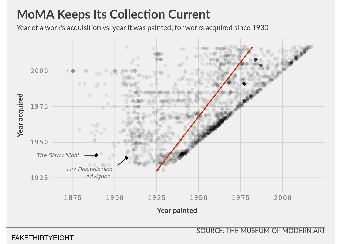
Faceting by gender
# some prep work before ggplot:
moma_solo_artist <- moma %>%
  filter(num_artists == '1')
# now to make the graphs!
viz_8_2 <- ggplot(data = moma_solo_artist, aes(x = year_created, y = year_acquired)) +
geom_point(na.rm = TRUE, alpha = 0.08, stroke = 0, shape = "circle", size = 2) +
facet_wrap(~artist_gender) +
geom_segment(aes(x = 1925, y = 1930, xend = 1982, yend = 2017), colour = "#CF2500", show.legend = FALSE) +
labs(title = 'MoMA Keeps Its Collection Current',
subtitle = "Year of a work's acquisition vs. year it was painted, for works acquired since 1930",
x = "Year painted", y = "Year acquired", caption = "SOURCE: THE MUSEUM OF MODERN ART") +
coord_fixed(ratio = 1.4, xlim = c(1870,2018), ylim = c(1920, 2018), clip = "off") +
scale_x_continuous(breaks = seq(from = 1875, to = 2000, by = 25)) +
scale_y_continuous(breaks = seq(from = 1925, to = 2000, by = 25)) +
theme_fivethirtyeight(base_family = 'Lato') +
theme(axis.title = element_text(inherit.blank = FALSE, face = 'bold', size = 11),
axis.title.x = element_text(margin = margin(t = 10, b = 10, unit = 'pt'), hjust = 0.45),
axis.title.y = element_text(margin = margin(r = 10, unit = 'pt'), vjust = 0.45),
axis.text = element_text(colour = 'gray50', family = 'Courier', face = 'bold', size = 9),
plot.title = element_text(face = "bold"),
plot.title.position = "plot",
plot.subtitle = element_text(size = 10.5, margin = margin(b = 10, unit = 'pt')),
plot.caption = element_text(family = "Lato", margin = margin(t = 10, b = 0, unit = 'pt')),
panel.grid = element_line(colour = 'gray50'))
viz_8_2
Exploring Painting Dimensions
# adjust the data before graphing:
moma_dimensions_OP <- moma %>%
  filter(height_cm <= 457.2 & width_cm <= 762) %>%
# add column to characterize if paintings are tall or wide
  mutate(height_over_width = height_cm/width_cm,
         hw_ratio_type = case_when(
           height_over_width > 1 ~ "tall and thin",
           height_over_width == 1 ~ "equivalent sides",
           height_over_width < 1 ~ "short and wide")) %>%
# add columns to convert cm to ft
  mutate(height_ft = height_cm / (12 * 2.54), width_ft = width_cm / (12 * 2.54))

# to make best-fit lines, need to filter by dimension ratios:
moma_dimensions_tall <- moma_dimensions_OP %>%
  filter(hw_ratio_type == "tall and thin")
moma_dimensions_wide <- moma_dimensions_OP %>%
  filter(hw_ratio_type == "short and wide")

# again make a second df to emphasize certain data points
moma_callouts_hw <-  moma_dimensions_OP %>%
  filter(title == 'The Starry Night' | title == "Les Demoiselles d'Avignon" | title == "Dance (I)")
Challenge #4
viz_9_1 <- ggplot(data = moma_dimensions_OP, aes(x = width_ft, y = height_ft)) +
  geom_point(na.rm = TRUE, alpha = 0.15, stroke = 0, shape = "circle", size = 2.5, show.legend = FALSE,
             aes(colour = hw_ratio_type)) +
  labs(title = 'MoMA Paintings, Tall and Wide',
       subtitle = "Dimensions of over 2,000 paintings in the collection",
       x = "Width", y = "Height", caption = "SOURCE: THE MUSEUM OF MODERN ART") +
  coord_fixed(ratio = 0.95, xlim = c(0, 24), ylim = c(0, 15), clip = "off") +
  scale_x_continuous(breaks = seq(from = 0, to = 20, by = 5)) +
  scale_y_continuous(breaks = seq(from = 0, to = 15, by = 5)) +
  theme_fivethirtyeight(base_family = 'Lato') +
  geom_smooth(data = moma_dimensions_tall, method = lm, formula = y ~ x - 1,
              se = FALSE, na.rm = TRUE, show.legend = FALSE, fullrange =  FALSE, colour = "#E49100") +
  geom_smooth(data = moma_dimensions_wide, method = lm, formula = y ~ x - 1,
              se = FALSE, na.rm = TRUE, show.legend = FALSE, fullrange =  FALSE, colour = "#994CE0") +
  annotate("segment", x = -5, xend = 26, y = -4, yend = -4, colour = 'gray50') +
  annotate("text", x = -1.3, y = -4.7, label = "FAKETHIRTYEIGHT", size = 3.5) +
  annotate("segment", x = 0, xend = 0, y = -1, yend = 15.75, colour = 'gray50') +
  annotate("segment", x = -1.25, xend = 25.5, y = 0, yend = 0, colour = 'gray50') +
# add les desmoiselles annotation
  annotate("text", x = 2, y = 8.5, label = "Les Desmoiselles", fontface = "italic", size = 3, colour = "#E49100") +
  annotate("text", x = 2.5, y = 7.75, label = "d'Avignon", fontface = "italic", size = 3, colour = "#E49100") +
  annotate("segment", x = 4.75, xend = 7.6, y = 8, yend = 8, colour = 'black') +
# add starry night annotation.
  annotate("text", x = 7.75, y = 2.4, label = "The Starry Night", fontface = "italic", size = 3, colour = "#994CE0") +
  annotate("segment", x = 3, xend = 5.25, y = 2.4, yend = 2.4, colour = 'black') +
# add dance annotation.
  annotate("text", x = 16, y = 8.5, label = "Dance (I)", fontface = "italic", size = 3, colour = "#994CE0") +
  annotate("segment", x = 12.8, xend = 14.5, y = 8.5, yend = 8.5, colour = 'black') +
# add color key:
  annotate("text", x = 12.5, y = 12.75, label = "Taller", fontface = "bold", size = 3, colour = "#E49100") +
  annotate("text", x = 11.8, y = 12, label = "than wide", fontface = "bold", size = 3, colour = "#E49100") +
  annotate("text", x = 16.3, y = 12.75, label = "Wider", fontface = "bold", size = 3, colour = "#994CE0") +
  annotate("text", x = 16.7, y = 12, label = "than tall", fontface = "bold", size = 3, colour = "#994CE0") +
# add second plot here to create annotations (oredered on top of annotations for proper visuals)
  geom_point(data = moma_callouts_hw, na.rm = TRUE, alpha = 1, stroke = 0.5,
             shape = "circle filled", size = 2, show.legend = FALSE, aes(fill = hw_ratio_type)) +
  scale_colour_manual(name = "", values = c("gray50", "#994CE0", "#E49100"), aesthetics = c("colour", "fill")) +
  theme(axis.title = element_text(inherit.blank = FALSE, face = 'bold', size = 11),
        axis.title.x = element_text(margin = margin(t = 10, b = 10, unit = 'pt'), hjust = 0.45),
        axis.title.y = element_text(margin = margin(r = 10, unit = 'pt'), vjust = 0.45),
        axis.text = element_text(colour = 'gray50', family = 'Courier', face = 'bold', size = 10),
        plot.title = element_text(face = "bold"),
        plot.title.position = "plot",
        plot.subtitle = element_text(size = 10.5, margin = margin(b = 10, unit = 'pt')),
        plot.caption = element_text(family = "Lato", margin = margin(t = 1, b = 0, unit = 'pt')),
        panel.grid = element_line(colour = 'gray50'))
viz_9_1
Different colors
# note: I picked colors that are listed in our 04/13/20 lecture as friendly for color sensitivity and qualitative.
viz_9_1 +
  scale_colour_manual(name = "", values = c("gray50", "#CC79A7", "#009E73"), aesthetics = c("colour", "fill"))
Scale for 'colour' is already present. Adding another scale for 'colour',
which will replace the existing scale.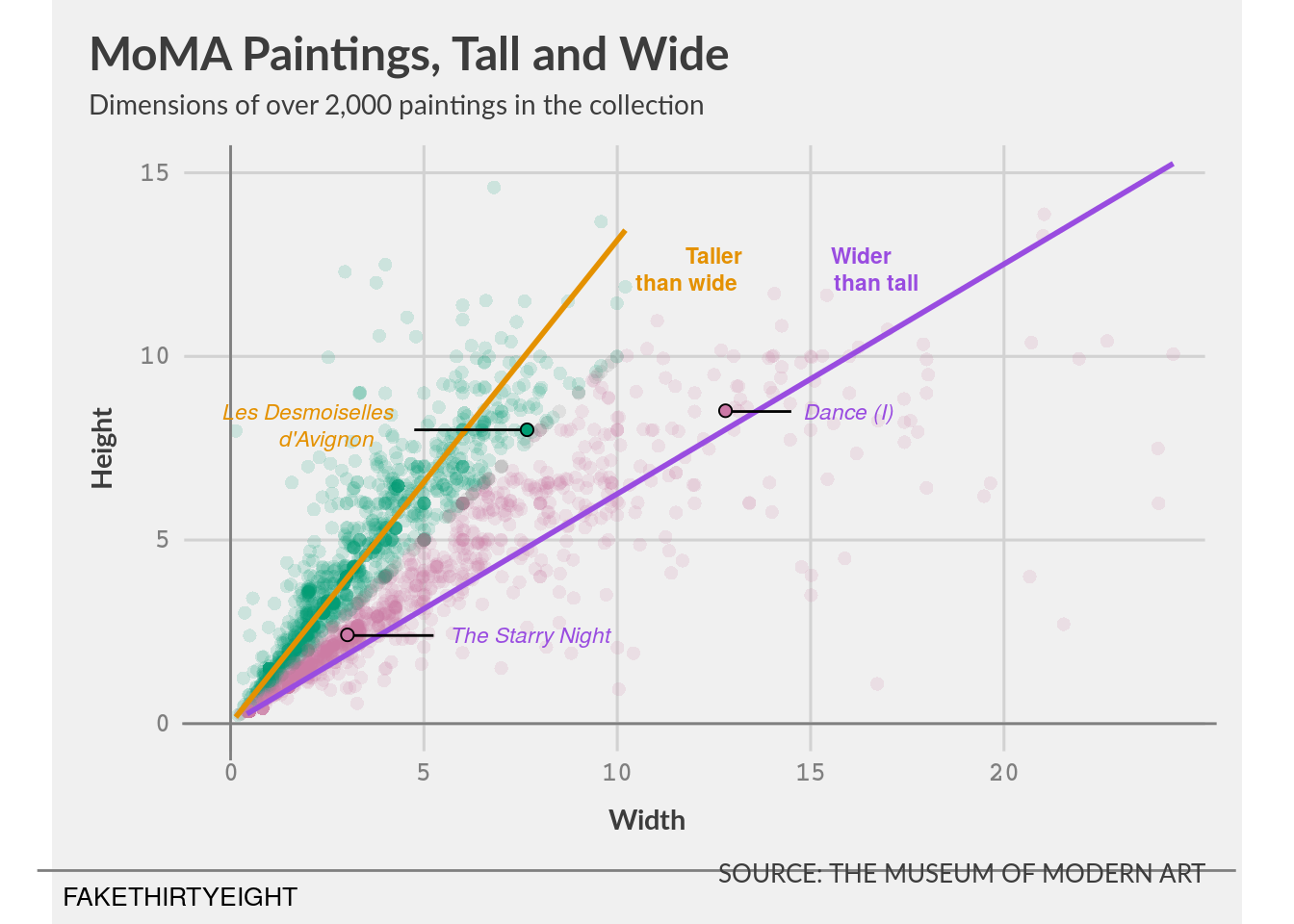
viz_10_1 <- ggplot(data = moma_dimensions_OP, aes(x = width_ft, y = height_ft)) +
  geom_point(na.rm = TRUE, alpha = 0.15, stroke = 0, shape = "circle", size = 2.5, show.legend = FALSE,
             aes(colour = hw_ratio_type)) +
  labs(title = 'MoMA Paintings, Tall and Wide',
       subtitle = "Dimensions of over 2,000 paintings in the collection",
       x = "Width", y = "Height", caption = "SOURCE: THE MUSEUM OF MODERN ART") +
  coord_fixed(ratio = 0.95, xlim = c(0, 24), ylim = c(0, 15), clip = "off") +
  scale_x_continuous(breaks = seq(from = 0, to = 20, by = 5)) +
  scale_y_continuous(breaks = seq(from = 0, to = 15, by = 5)) +
  theme_fivethirtyeight(base_family = 'Lato') +
  geom_smooth(data = moma_dimensions_tall, method = lm, formula = y ~ x - 1, se = FALSE,
              na.rm = TRUE, show.legend = FALSE, fullrange =  FALSE, colour = "#009E73") +
  geom_smooth(data = moma_dimensions_wide, method = lm, formula = y ~ x - 1,
              se = FALSE, na.rm = TRUE, show.legend = FALSE, fullrange =  FALSE, colour = "#CC79A7") +
  annotate("segment", x = -5, xend = 26, y = -4, yend = -4, colour = 'gray50') +
  annotate("text", x = -1.3, y = -4.7, label = "FAKETHIRTYEIGHT", size = 3.5) +
  annotate("segment", x = 0, xend = 0, y = -1, yend = 15.75, colour = 'gray50') +
  annotate("segment", x = -1.25, xend = 25.5, y = 0, yend = 0, colour = 'gray50') +
# add les desmoiselles annotation
  annotate("text", x = 2, y = 8.5, label = "Les Desmoiselles", fontface = "italic", size = 3, colour = "#009E73") +
  annotate("text", x = 2.5, y = 7.75, label = "d'Avignon", fontface = "italic", size = 3, colour = "#009E73") +
  annotate("segment", x = 4.75, xend = 7.6, y = 8, yend = 8, colour = 'black') +
# add starry night annotation.
  annotate("text", x = 7.75, y = 2.4, label = "The Starry Night", fontface = "italic", size = 3, colour = "#CC79A7") +
  annotate("segment", x = 3, xend = 5.25, y = 2.4, yend = 2.4, colour = 'black') +
# add dance annotation.
  annotate("text", x = 16, y = 8.5, label = "Dance (I)", fontface = "italic", size = 3, colour = "#CC79A7") +
  annotate("segment", x = 12.8, xend = 14.5, y = 8.5, yend = 8.5, colour = 'black') +
# add color key:
  annotate("text", x = 12.5, y = 12.75, label = "Taller", fontface = "bold", size = 3, colour = "#009E73") +
  annotate("text", x = 11.8, y = 12, label = "than wide", fontface = "bold", size = 3, colour = "#009E73") +
  annotate("text", x = 16.3, y = 12.75, label = "Wider", fontface = "bold", size = 3, colour = "#CC79A7") +
  annotate("text", x = 16.7, y = 12, label = "than tall", fontface = "bold", size = 3, colour = "#CC79A7") +
  geom_point(data = moma_callouts_hw, na.rm = TRUE, alpha = 1, stroke = 0.5, shape = "circle filled",
             size = 2, show.legend = FALSE, aes(fill = hw_ratio_type)) +
  scale_colour_manual(name = "", values = c("gray50", "#CC79A7", "#009E73"), aesthetics = c("colour", "fill")) +
  theme(axis.title = element_text(inherit.blank = FALSE, face = 'bold', size = 11),
        axis.title.x = element_text(margin = margin(t = 10, b = 10, unit = 'pt'), hjust = 0.45),
        axis.title.y = element_text(margin = margin(r = 10, unit = 'pt'), vjust = 0.45),
        axis.text = element_text(colour = 'gray50', family = 'Courier', face = 'bold', size = 10),
        plot.title = element_text(face = "bold"),
        plot.title.position = "plot",
        plot.subtitle = element_text(size = 10.5, margin = margin(b = 10, unit = 'pt')),
        plot.caption = element_text(family = "Lato", margin = margin(t = 1, b = 0, unit = 'pt')),
        panel.grid = element_line(colour = 'gray50'))
viz_10_1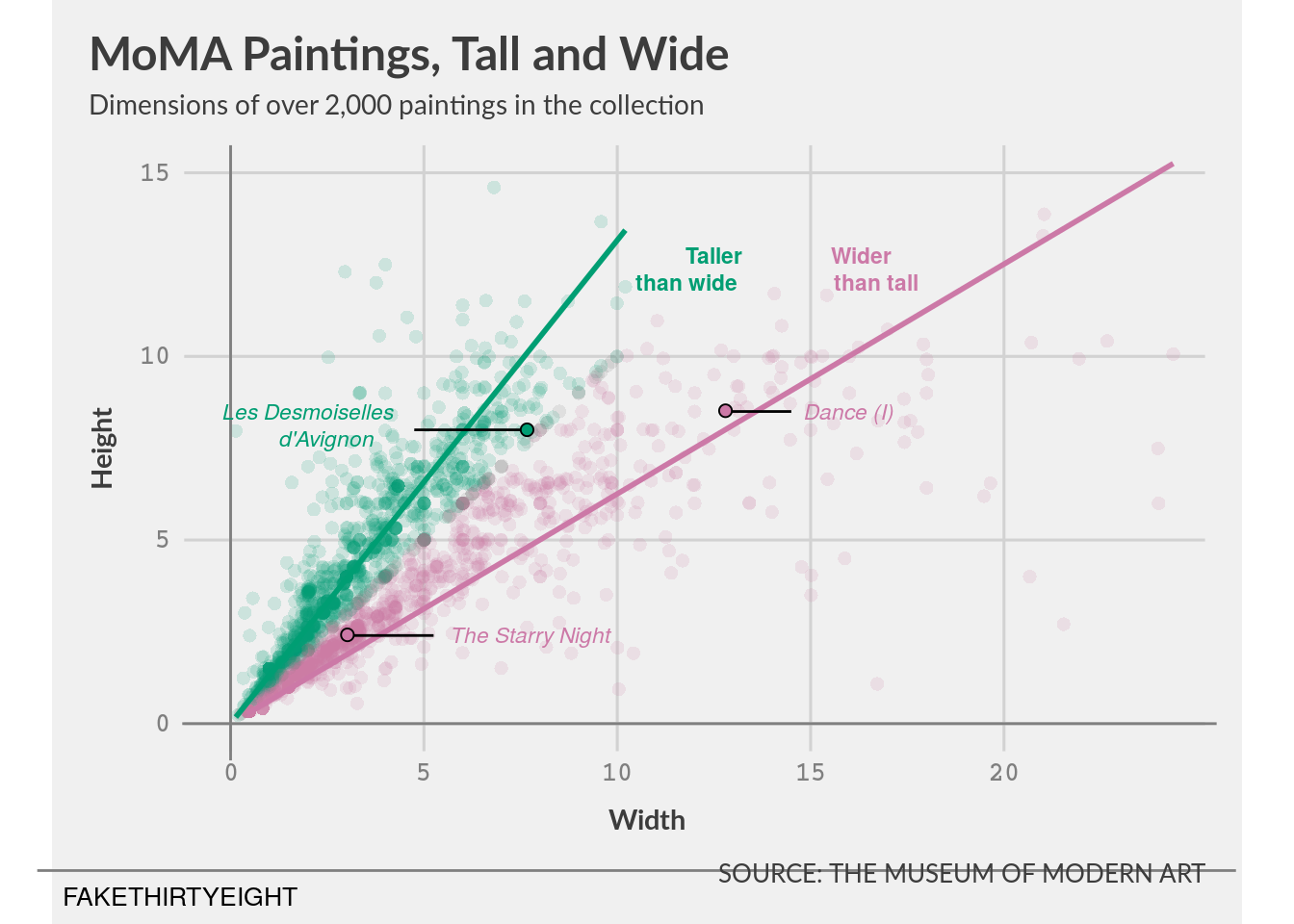
Experimenting with geom_annotate()
oops, I already did this bit above.
Challenge #5, on your own!
Formulate a research focus
I want to explore the factors that would impact whether an artist’s work is acquired by MoMA during their lifetime or after their death. Since there is a Western cultural stereotype of “starving artists that tragically gain recognition after death”, I am curious if the MoMA 1) follows this trend and 2) other factors that relate to year of acquisition.
As with the earlier analyses, I will need to remove any multi-author pieces.
Potential variables to look at: 1) is artist dead when artwork acquired? (also look at same artist’s work before and after death) 2) age at death (artist_birth_year and artist_death_year) 3) age of artwork at death (artist_death_year and year_created) 4) nationality (I’ll have to clean up the artist_bio column) 5) artist_gender 6) method of acquisition (gift vs. purchase vs. exchange)
Clean and explore the data
# starting clean, so I'll re-load the .csv file into a new dataframe
momadata <- read_csv(here::here("/static/projects/artworks-cleaned.csv")) %>%
  filter(num_artists == 1) %>%
  select(-num_artists, -n_female_artists, -n_male_artists, -classification, -department) %>%
# add column - was artist alive when work acquired?
  mutate(status_when_acq = case_when( # assuming that if death year is missing, artist is alive
            artist_death_year < year_acquired ~ "dead at acq",
            artist_death_year == year_acquired ~ "same year of death and acq",
            artist_death_year > year_acquired | TRUE ~ "alive at acq"),
         ctime_to_acq = year_acquired - year_created, # how long did it take to acquire the work after it was created?
         dtime_to_acq = case_when( # add column - how long since artist death was artwork acquired?
            status_when_acq == 'dead at acq' ~ year_acquired - artist_death_year,
            status_when_acq == 'same year of death and acq' ~ 0,
            TRUE ~ NA_real_)) %>%
# artist's age at death
  group_by(artist) %>%
  mutate(artist_death_age = case_when(
    artist_death_year < 2017 ~ artist_death_year - artist_birth_year,
    TRUE ~ NA_real_)) # assuming that if death year is missing, artist is alive
Parsed with column specification:
cols(
.default = col_double(),
title = col_character(),
artist = col_character(),
artist_bio = col_character(),
artist_gender = col_character(),
circumference_cm = col_logical(),
diameter_cm = col_logical(),
length_cm = col_logical(),
seat_height_cm = col_logical(),
purchase = col_logical(),
gift = col_logical(),
exchange = col_logical(),
classification = col_character(),
department = col_character()
)See spec(...) for full column specifications.summarise(momadata, median(artist_death_age, na.rm = TRUE)) `summarise()` ungrouping output (override with `.groups` argument)# artist's age at acquisition
momadata <- momadata %>%
mutate(artist_acq_age = case_when(
status_when_acq == 'dead at acq' ~ NA_real_,
TRUE ~ year_acquired - artist_birth_year)) # includes data if same year death and acquisition
summarise(momadata,median(artist_acq_age, na.rm = TRUE)) `summarise()` ungrouping output (override with `.groups` argument)# since I already have their birth and death years in columns, I'll make a new column with the nationality information, splitting at the comma before the years
momadata <- momadata %>%
separate(artist_bio, c("artist_nationality","artist_bio_extras"),",", extra = 'merge') %>% #split away the dates
mutate(artist_nationality = gsub('\\(', "", artist_nationality)) %>% # clean up extra symbols
mutate(artist_nationality = gsub('\\)', "", artist_nationality)) %>%
select(-artist_bio_extras) # remove the dump column
momadata %>%
group_by(artist_nationality) %>%
summarise(n())`summarise()` ungrouping output (override with `.groups` argument)#note: there are still some data points that aren't perfectly clean (two nationalities) but I'll have to live with that. Obviously nationality is not something that is 1) fixed or 2) only 1 'type', so this is an approximation anyway. And geopolitical factors might have played into designating a certain nationality over another, and cultural environments within a politically-defined border affect national identities as well.
# check the gender data
momadata %>%
group_by(artist_gender) %>%
summarise(n()) # as we knew from above data, this column is cleam`summarise()` ungrouping output (override with `.groups` argument)# check the methods of acquisition
momadata %>%
group_by(gift) %>%
summarise(n())`summarise()` ungrouping output (override with `.groups` argument)# just over half (1163) of these are gifts
momadata %>%
group_by(purchase) %>%
summarise(n())`summarise()` ungrouping output (override with `.groups` argument)# 198 paintings were purchased
momadata %>%
group_by(exchange) %>%
summarise(n())`summarise()` ungrouping output (override with `.groups` argument)# and 145 were 'exchanges'.
momadata <- momadata %>% # use case_when again to easily designate entries with missing acquisition data
mutate(acq_method = case_when(
gift == TRUE ~ "gift",
exchange == TRUE ~ "exchange",
purchase == TRUE ~ "purchase",
TRUE ~ "missing data"))
momadata %>%
group_by(acq_method) %>%
summarise(n())`summarise()` ungrouping output (override with `.groups` argument)# make additional columns to look at before- and after- death data from same artist
momadata <- momadata %>%
group_by(status_when_acq, artist) %>%
mutate(
avg_dead_ctime = case_when(
status_when_acq == "dead at acq" ~ median(ctime_to_acq),
status_when_acq != "dead at acq" ~ NA_real_),
avg_alive_ctime = case_when(
status_when_acq == "dead at acq" ~ NA_real_,
status_when_acq != "dead at acq" ~ median(ctime_to_acq))) %>%
ungroup() %>%
group_by(artist) %>%
mutate(artworks_acq = n()) %>%
ungroup()
# create new df to show data that should be analyzed without biasing for number of works in MoMA
moma_gp <- momadata %>%
select(title, artist,artist_nationality,artist_birth_year,artist_death_year,
artist_gender,artist_death_age,avg_dead_ctime,avg_alive_ctime) %>%
group_by(artist) %>%
arrange(artist) %>%
summarise(avg_alive_ctime = mean(avg_alive_ctime, na.rm = TRUE),
avg_dead_ctime = mean(avg_dead_ctime, na.rm = TRUE),
artist_nationality = first(artist_nationality),
artist_birth_year = first(artist_birth_year),
artist_death_year = first(artist_death_year),
artist_gender = first(artist_gender),
artist_death_age = first(artist_death_age),
artworks_acq = n()) %>%
mutate(both_alive_dead = case_when(
!is.na(avg_alive_ctime) & !is.na(avg_dead_ctime) ~ "both",
TRUE ~ "else"), avg_alive_ctime = avg_alive_ctime, avg_dead_ctime = avg_dead_ctime)`summarise()` ungrouping output (override with `.groups` argument)Down to business
How does MoMA decide which artwork to acquire? Is the perception of a painting’s quality affected by the artist’s death? What other factors are involved?
Let’s start here.
About three quarters of MoMA paintings were obtained when the artist was alive.
viz_one <- ggplot(data = momadata, aes(x = status_when_acq),na.rm = TRUE) +
  geom_bar(stat = "count", width = .75, aes(fill = status_when_acq), show.legend = FALSE, colour = "#000000") +
  labs(title = "What factors affect MoMA artwork acquisition?",
       subtitle = "MoMA has acquired the majority of their artwork while the artist is alive",
       x = NULL) +
  scale_fill_viridis_d(alpha = 0.95, begin = 0, end = 1, direction = 1, option = "D", aesthetics = c("colour", "fill")) +
  theme(axis.title = element_text(inherit.blank = FALSE, family = "Lato", face = 'bold', size = 11),
        axis.title.x = element_text(margin = margin(t = 10, b = 10, unit = 'pt'), hjust = 0.45),
        axis.title.y = element_text(margin = margin(r = 10, unit = 'pt'), vjust = 0.45),
        axis.text = element_text(colour = 'gray30', family = 'Courier', face = 'bold', size = 10),
        plot.title = element_text(family = "Lato",face = "bold"),
        plot.title.position = "panel",
        plot.subtitle = element_text(size = 10.5, margin = margin(b = 10, unit = 'pt')),
        plot.caption = element_text(family = "Lato", margin = margin(t = 1, b = 0, unit = 'pt')),
        panel.grid = element_line(colour = 'gray80'))
viz_one
#### Diving deeper!
As time passes, MoMA is acquiring more paintings that are older at time of acquisition. Similarly, more of these older paintings are acquired after the artist has passed.
#### Diving deeper!
As time passes, MoMA is acquiring more paintings that are older at time of acquisition. Similarly, more of these older paintings are acquired after the artist has passed.
facet_labs <- c('alive at acq' = "Alive when artwork acquired",
                'dead at acq' = "Deceased when artwork acquired",
                'same year of death and acq' = "should not be in the graph anyway")
viz_try_again <- ggplot(data = subset(momadata, status_when_acq != "same year of death and acq")) +
  geom_point(na.rm = TRUE, alpha = 0.35, aes(x = year_acquired, y = ctime_to_acq, colour = artworks_acq), show.legend = TRUE) +
  facet_wrap(~status_when_acq, labeller = as_labeller(facet_labs)) +
  labs(title = "What factors affect MoMA artwork acquisition?",
       subtitle = "More of MoMA's acquisitions come from older paintings",
       x = "Year when MoMA acquired painting", y = "Age of painting at acquisition") +
  scale_colour_gradient(low = "#001a26", high = "#00aeff", space = "Lab", na.value = "grey80",
                       name = "# paintings per artist", aesthetics = c("colour", "fill")) +
  coord_cartesian(xlim = c(1928,2018)) +
  scale_x_continuous(breaks = seq(1930, 2010, 20)) +
  scale_y_continuous(breaks = seq(0,125,25)) +
  theme(axis.title = element_text(inherit.blank = FALSE, family = "Lato", size = 12),
        axis.title.x = element_text(margin = margin(t = 10, b = 10, unit = 'pt'), hjust = 0.45),
        axis.title.y = element_text(margin = margin(r = 10, unit = 'pt'), vjust = 0.45),
        axis.text = element_text(colour = 'gray30', family = 'Courier', face = 'bold', size = 10),
        axis.ticks = element_line(colour = 'gray50'),
        legend.text = element_text(colour = 'gray10', family = "Lato"),
        legend.title = element_text(size = 9),
        strip.background = element_blank(),
        strip.text = element_text(family = "Lato",face = "bold", size = 10),
        plot.title = element_text(family = "Lato",face = "bold"),
        plot.title.position = "panel",
        plot.subtitle = element_text(size = 10.5, margin = margin(b = 10, unit = 'pt')),
        plot.caption = element_text(family = "Lato", margin = margin(t = 1, b = 0, unit = 'pt')),
        panel.background = element_rect(colour = "gray60", fill = "#FFFFFF"),
        panel.grid = element_line(colour = 'gray90'))
viz_try_again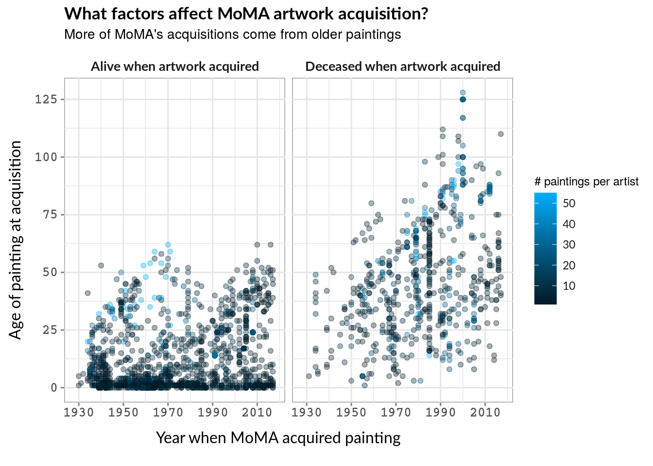
Considering that MoMA is the Museum of Modern Art, it’s interesting to see that they are increasingly acquiring older paintings. It is notable that many of the older paintings acquired are from (live or dead) artists that are already prevalent in their collection, as seen in the light blue.
viz_three <- viz_try_again +
geom_point(data = subset(momadata, status_when_acq != "same year of death and acq" & acq_method == 'purchase'),
na.rm = TRUE, alpha = 0.85, color = "red", aes(x = year_acquired, y = ctime_to_acq), show.legend = TRUE) +
facet_wrap(~status_when_acq, labeller = as_labeller(facet_labs)) +
labs(title = "What factors affect MoMA artwork acquisition?",
subtitle = "MoMA has actively purchased newer artworks",
x = "Year when MoMA acquired painting", y = "Age of painting at acquisition")
viz_three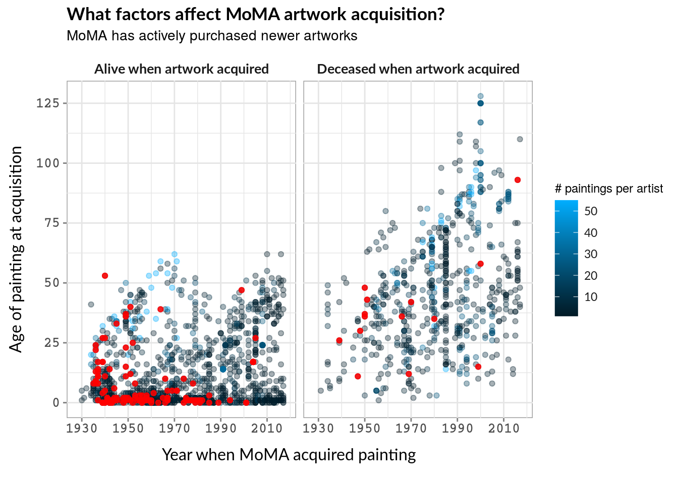 Conversely, MoMA actively purchases newer paintings rather than older ones. This could be due to standard practice in the art-selling world, of which I know nothing. To actually learn more about their acquisition behavior, the best step would be to compare with more museums (of Modern and Other Art) and compare across.
In creating these graphs, I struggled a lot with translating “things I can do” with “graphs that actually make sense to create”. For example, I spent a lot of time cleaning up the data about nationality with absolutely no way to present it on a graph in a way that would help answer the question I am asking. While one facet of data visualization is knowing when to not present data, I clearly still need to learn how to mentally determine a good visualization before trying to just make one.
In the end, my favorite graph is the second one (“More of MoMA’s acquisitions come from older paintings”). I first tried to use two colors on one graph to demonstrate the patterns of painting age and artist death status. However, splitting the graph allows easy side-by-side comparison. I could then use color to add a third dimension (number of artworks per artist) without intruding on the graph’s readibility.