library(tidyverse)
library(here)
library(sf)
library(sp)
library(tmap)
library(osmdata)
library(ggmap)
library(readxl)
library(classInt)
library(cowplot)
library(maps)
library(ggspatial)
library(shiny)
library(RColorBrewer)
library(leaflet)
library(leaflet.esri)
library(janitor)
Step one: load data and inspect it!
trees_raw <- read_csv(here::here("static/projects/lab08data/Parks_Tree_Inventory.csv")) %>%
  glimpse()
## Parsed with column specification:
## cols(
## .default = col_character(),
## X = col_double(),
## Y = col_double(),
## OBJECTID = col_double(),
## DBH = col_double(),
## TreeHeight = col_double(),
## CrownWidthNS = col_double(),
## CrownWidthEW = col_double(),
## CrownBaseHeight = col_double(),
## UserID = col_double(),
## Structural_Value = col_double(),
## Carbon_Storage_lb = col_double(),
## Carbon_Storage_value = col_double(),
## Carbon_Sequestration_lb = col_double(),
## Carbon_Sequestration_value = col_double(),
## Stormwater_ft = col_double(),
## Stormwater_value = col_double(),
## Pollution_Removal_value = col_double(),
## Pollution_Removal_oz = col_double(),
## Total_Annual_Benefits = col_double()
## )## See spec(...) for full column specifications.#load the shp data with the sf package
pdx_bounds <- st_read(here::here("static/projects/lab08data/Neighborhoods__Regions_-shp/"))
river_bounds <- st_read(here::here("static/projects/lab08data/Willamette_Columbia_River_Ordinary_High_Water-shp/"))
trees_shape <- st_read(here::here("static/projects/lab08data/Parks_Tree_Inventory-shp/"))
farm_mark <- st_read(here::here("static/projects/lab08data/Farmers_Markets-shp/"))
grocerys <- st_read(here::here("static/projects/lab08data/Grocery_Stores-shp/"))st_crs(trees_shape)
st_crs(pdx_bounds)
st_crs(river_bounds)
st_crs(farm_mark)
st_crs(grocerys)So we know that all three use the crs 3857, which is also WGS 84 or Pseudo Mercator, an the units of the map are in meters
trees_shape$geometry
## Geometry set for 25534 features
## geometry type:  POINT
## dimension:      XY
## bbox:           xmin: -13667450 ymin: 5692149 xmax: -13635010 ymax: 5724486
## CRS:            3857
## First 5 geometries:
## POINT (-13658194 5712487)
## POINT (-13658213 5712485)
## POINT (-13658254 5712491)
## POINT (-13658227 5712487)
## POINT (-13658234 5712488)
Here are our relative locations! xmin: -13667450 ymin: 5692149 xmax: -13635010 ymax: 5724486
Let’s start mapping!
Challenge 1:
Make a version of this map centered on your neighborhood, zoomed such that each of the bordering neighborhoods is visible (if “each” is too many to be useful, go with “most” or “some”).
pdx_bounds %>%
  ggplot() +
  geom_sf() +
  coord_sf(
    xlim=c(-13655500,-13645500),
    ylim=c(5698900, 5704250)) +
    geom_sf_label(aes(label=MAPLABEL)) #MAPLABEL is a column within pdx_bounds
Challenge 2:
That blue is pretty deep and intense; change it to something a bit more river-like. While you’re at it, the grey background for the neighborhoods is also a bit blah. Try changing it to something else.
pdx_bounds %>%
  ggplot() +
  geom_sf(fill = "darkred", colour = "grey80") +
  geom_sf(data=river_bounds, fill="#026F86", size=0.0, alpha = 0.85)+
  coord_sf(xlim=c(-13678000,-13630000), ylim=c(5689000, 5727000)) +
  theme_dark()
Challenge 3:
Pick a different projection, and show how it looks with at least two different center points. Here is a guide to a little bit more information about the syntax for the proj4 specification.
world1 <- st_as_sf(map('world', plot = FALSE, fill = TRUE))
world2 <- st_transform(
  world1, "+proj=laea +lat_0=54.48 +lon_0=-5.93 +ellps=EPSG:102663 +no_defs"
  )
ggplot() +
  geom_sf(data = world2) +
  labs(title = "Hawaii State Plane Zone 3 projection (EPSG:102663)",
       subtitle = "centered on Belfast, Northern Ireland (lon: -5.93, lat: 54.48)")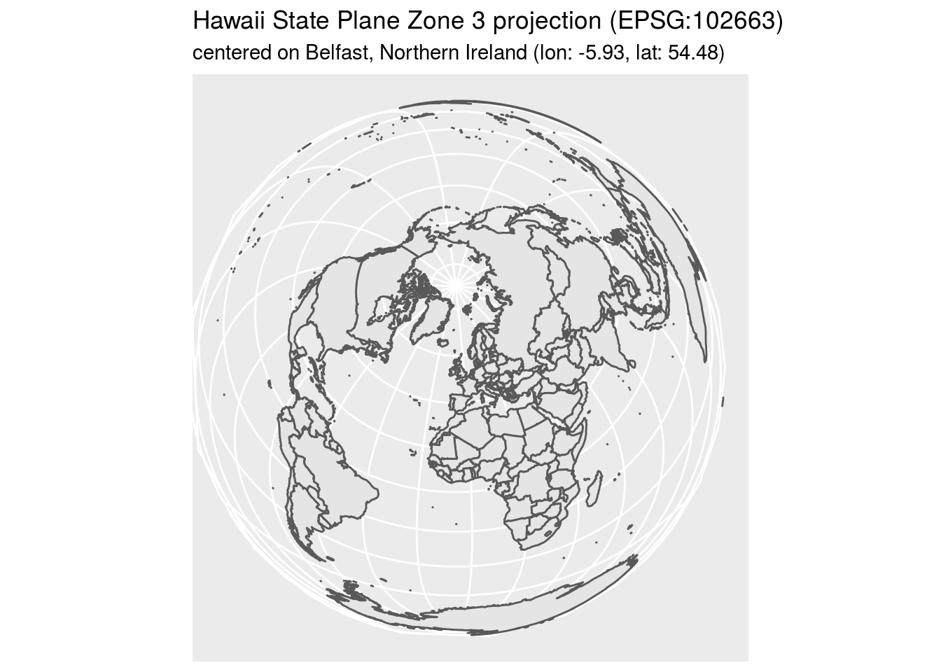
world3 <- st_transform(
  world1, "+proj=laea +lat_0=-25.69 +lon_0=30.04 +ellps=EPSG:102663 +no_defs"
  )
ggplot() +
  geom_sf(data = world3) +
  labs(title = "Hawaii State Plane Zone 3 projection (EPSG:102663)",
       subtitle = "centered on Belfast, South Africa (lon: 30.04, lat: -25.69)")
Challenge 4:
Create a map showing the location of grocery stores and farmer’s markets, with a different point shape used to indicate which is which.
# legend_fix_ugh <- rergsfd g5ermhj 4liueksadjf.olesfjpoew;lj. fhrsdfapoe;wl.s/kfc pe, UGH I HATE THESE

pdx_bounds %>%
  ggplot() +
  geom_sf(aes(fill = "M"), colour = "grey50", show.legend = FALSE) +
  geom_sf(data = river_bounds, aes(fill = "R"), size = 0.0, alpha = 0.85, show.legend = FALSE) +
  geom_sf(data = grocerys, aes(fill = "G"), colour = "#111111",
          shape = 21, stroke = 0.25, size = 2, show.legend = "point") +
  geom_sf(data = farm_mark, aes(fill = "F"), colour = "#111111",
          shape = 24, stroke = 0.25, size = 2, show.legend = "point") +
  coord_sf(xlim = c(-13678000,-13630000),
           ylim = c(5689000, 5727000)) +
  labs(title = "Challenge 4 map",
       fill = "Map: ") +
  scale_fill_manual(breaks = c("G", "F"), #NOTE FOR FUTURE: FOR SOME REASON breaks CONTROLS THE LEGEND
                    values = c("M" = "#eeeeee", "R" = "#026F86", "G" = "gold1", "F" = "darkred"),
                    guide = guide_legend(
                      label = TRUE,
                      override.aes = list(show.legend = c("point", "point"),
                                          shape = c(21, 24),
                                          fill = c("gold1", "darkred")),
                                         ),
                    labels = c("Grocery stores", "Farmers' markets")) +
  theme_minimal()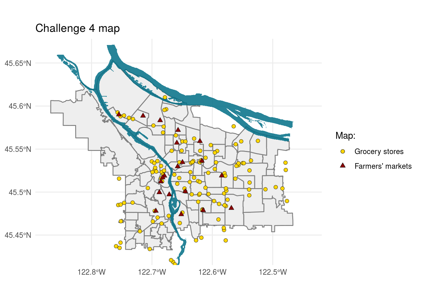
Challenge 5:
Follow this process (cropping the data set to a bounding box, etc.) for a park in your neighborhood, and create a comparable map.
pdx_bounds %>%
  ggplot() +
  geom_sf() +
  geom_sf(data = trees_shape) +
  coord_sf(
    xlim=c(-13650000,-13645000),
    ylim=c(5701000, 5704750)) +
  theme_minimal()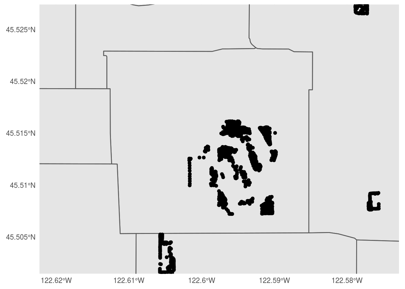
ch5_box <- data.frame(lon = c(-122.605, -122.585), lat = c(45.506, 45.518))
sf_project(st_crs(4326), st_crs(3857), ch5_box)
## [,1] [,2]
## [1,] -13648326 5701536
## [2,] -13646100 5703442ch5_trees <- st_crop(trees_shape, xmin = -13648326, xmax = -13646100, ymin = 5701536, ymax = 5703442)## Warning: attribute variables are assumed to be spatially constant throughout all
## geometriespaste0("Total number of trees in original dataset: ", length(trees_shape$geometry))## [1] "Total number of trees in original dataset: 25534"paste0("Number of trees in our bounding box: ", length(ch5_trees$geometry))## [1] "Number of trees in our bounding box: 1131"pdx_bounds %>%
ggplot() +
geom_sf() +
geom_sf(data = ch5_trees) +
coord_sf(
xlim=c(-13648326,-13646100),
ylim=c(5701536, 5703442)) +
labs(title = "Trees in Mt. Tabor Park") +
theme_minimal()
Challenge 6:
Using either ggmap or ggspatial, take your local park’s tree map (from challenge #5) and place it on a OpenStreetMap raster tile. Use at least one aesthetic mapping (color, point shape, etc.) to visualize at least one type of data about the trees (other than genus).
Feel free to experiment with different map tile styles!
st_bbox(ch5_trees)## xmin ymin xmax ymax
## -13647959 5701727 -13646633 5703148ch6_map <- get_stamenmap(c(left = -122.605, bottom = 45.506, right = -122.585, top = 45.518),
zoom = 14,
maptype = "terrain-background")## Source : http://tile.stamen.com/terrain-background/14/2612/5860.png## Source : http://tile.stamen.com/terrain-background/14/2613/5860.png## Source : http://tile.stamen.com/terrain-background/14/2612/5861.png## Source : http://tile.stamen.com/terrain-background/14/2613/5861.pngggmap(ch6_map)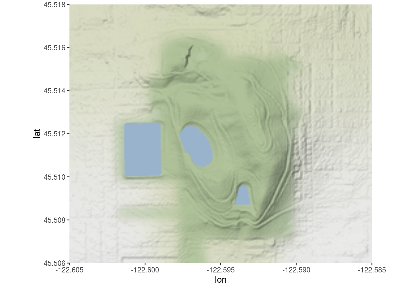
ch6_proj <- st_transform(ch5_trees, st_crs(4326))
ggmap(ch6_map) +
  geom_sf(data = ch6_proj, inherit.aes = FALSE,
          size = 0.5,
          aes(colour = Pollutio_1)) +
  scale_colour_distiller(palette = "BuPu", direction = -1) +
  labs(title = "Environmental potential of trees in Mt. Tabor",
       colour = "Pollution Removal (oz)")
## Coordinate system already present. Adding new coordinate system, which will replace the existing one.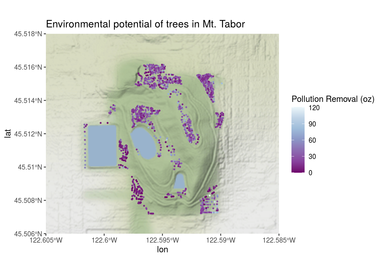
interactive sidbar
leaflet(ch6_proj) %>%
  addEsriBasemapLayer(esriBasemapLayers$Imagery) %>%
  setView(-122.593, 45.512, zoom = 15) %>%
  addCircleMarkers(label = ~Pollutio_1, radius = 5)
Challenge 7:
Look at the original spreadsheet and pick another column of interest (besides total population); revise the data ingest process, and map that column instead.
pdx_hh <- read_excel(here::here("static/projects/lab08data/Census_2010_Data_Cleanedup.xlsx"),
                     sheet = "Census_2010_Neighborhoods",
                     .name_repair = "universal",
                     trim_ws = TRUE) %>%
  clean_names()
## New names:
## * `` -> ...1
## * `Total Population` -> Total.Population
## * `` -> ...3
## * `` -> ...4
## * `` -> ...5
## * ...pdx_hh <- pdx_hh %>%
select(pdx_nhd = x1, nonfam = x69, total_hh = housing_units) %>%
mutate(pdx_nhd=as.factor(pdx_nhd))
# we need to do a tiny bit of cleanup; the census spreadsheet has some slightly different names
pdx_hh <- pdx_hh %>% mutate(pdx_nhd=recode(pdx_nhd,
"ARGAY" = "ARGAY TERRACE",
"BROOKLYN" = "BROOKLYN ACTION CORPS",
"BUCKMAN" = "BUCKMAN COMMUNITY ASSOCIATION",
"CENTENNIAL" = "CENTENNIAL COMMUNITY ASSOCIATION",
"CULLY" = "CULLY ASSOCIATION OF NEIGHBORS",
"CENTENNIAL" = "CENTENNIAL COMMUNITY ASSOCIATION",
"DOWNTOWN" = "PORTLAND DOWNTOWN",
"GOOSE HOLLOW" = "GOOSE HOLLOW FOOTHILLS LEAGUE",
"HAYDEN ISLAND" = "HAYDEN ISLAND NEIGHBORHOOD NETWORK",
"HOSFORD-ABERNETHY" = "HOSFORD-ABERNETHY NEIGHBORHOOD DISTRICT ASSN.",
"IRVINGTON" = "IRVINGTON COMMUNITY ASSOCIATION",
"LLOYD DISTRICT" = "LLOYD DISTRICT COMMUNITY ASSOCIATION",
"NORTHWEST DISTRICT" = "NORTHWEST DISTRICT ASSOCIATION",
"OLD TOWN-CHINATOWN" = "OLD TOWN COMMUNITY ASSOCIATION",
"PARKROSE HEIGHTS" = "PARKROSE HEIGHTS ASSOCIATION OF NEIGHBORS",
"PEARL" = "PEARL DISTRICT",
"SABIN" = "SABIN COMMUNITY ASSOCIATION",
"SELLWOOD-MORELAND" = "SELLWOOD-MORELAND IMPROVEMENT LEAGUE",
"SOUTHWEST HILLS" = "SOUTHWEST HILLS RESIDENTIAL LEAGUE",
"SUMNER" = "SUMNER ASSOCIATION OF NEIGHBORS",
"SUNDERLAND" = "SUNDERLAND ASSOCIATION OF NEIGHBORS",
"WILKES" = "WILKES COMMUNITY GROUP"
))
pdx_hh <- pdx_hh %>%
filter(!is.na(pdx_nhd) & !is.na(nonfam) & !is.na(total_hh) & nonfam != "P0190017") %>%
mutate(nonfam = as.numeric(nonfam),
total_hh = as.numeric(total_hh)) %>%
mutate(nonfam_hh = (nonfam / total_hh))
pdx_hh## # A tibble: 95 x 4
## pdx_nhd nonfam total_hh nonfam_hh
## <fct> <dbl> <dbl> <dbl>
## 1 ALAMEDA 177 2058 0.0860
## 2 ARBOR LODGE 478 2774 0.172
## 3 ARDENWALD-JOHNSON CREEK 204 2118 0.0963
## 4 ARGAY TERRACE 197 2498 0.0789
## 5 ARLINGTON HEIGHTS 20 307 0.0651
## 6 ARNOLD CREEK 67 1221 0.0549
## 7 ASHCREEK 252 2535 0.0994
## 8 BEAUMONT-WILSHIRE 257 2319 0.111
## 9 BOISE 440 1537 0.286
## 10 BRENTWOOD-DARLINGTON 695 5107 0.136
## # … with 85 more rows# and now left join with our boundary data set- note that there will be some regions with no population data
bounds_hh <- left_join(pdx_bounds, pdx_hh, by=c("NAME"="pdx_nhd")) %>%
mutate(nonfam_area = (nonfam / (Shape_Area / 1E6)))
glimpse(bounds_hh)## Rows: 98
## Columns: 15
## $ OBJECTID <int> 1, 2, 3, 4, 5, 6, 7, 8, 9, 10, 11, 12, 13, 14, 15, 16, 17…
## $ NAME <fct> CATHEDRAL PARK, UNIVERSITY PARK, PIEDMONT, WOODLAWN, CULL…
## $ COMMPLAN <fct> NA, NA, ALBINA, ALBINA, NA, ALBINA, ALBINA, ALBINA, NA, N…
## $ SHARED <fct> NA, NA, NA, NA, NA, NA, NA, NA, NA, NA, NA, NA, NA, NA, N…
## $ COALIT <fct> NPNS, NPNS, NPNS, NECN, CNN, NPNS, NPNS, NECN, EPCO, CNN,…
## $ HORZ_VERT <fct> HORZ, HORZ, VERT, HORZ, HORZ, HORZ, HORZ, HORZ, HORZ, HOR…
## $ MAPLABEL <fct> Cathedral Park, University Park, Piedmont, Woodlawn, Cull…
## $ ID <int> 31, 88, 70, 93, 23, 2, 66, 19, 67, 84, 44, 48, 89, 63, 74…
## $ Shape_Leng <dbl> 11434.255, 11950.860, 10849.327, 8078.361, 18179.392, 946…
## $ Shape_Area <dbl> 5424297.8, 6981456.8, 6079530.0, 3870553.6, 16580624.7, 4…
## $ nonfam <dbl> 264, 401, 503, 446, 723, 478, 559, 784, 230, 129, 458, 61…
## $ total_hh <dbl> 1703, 1834, 2983, 2084, 5230, 2774, 2756, 4001, 2314, 898…
## $ nonfam_hh <dbl> 0.15502055, 0.21864776, 0.16862219, 0.21401152, 0.1382409…
## $ geometry <MULTIPOLYGON [m]> MULTIPOLYGON (((-13664216 5..., MULTIPOLYGON…
## $ nonfam_area <dbl> 48.66989, 57.43787, 82.73666, 115.22899, 43.60511, 104.20…bounds_hh %>%
ggplot() +
geom_sf(aes(fill = nonfam_hh)) +
scale_fill_distiller(palette = "OrRd", direction = 1, na.value = "grey35") +
labs(title = "Proportion of non-family households",
subtitle = "Nonfamily households per total households",
fill = "Nonfamily households") +
geom_sf(data = river_bounds, fill="#026F86", size=0.0) +
theme_minimal()
Note: I calculated the proportion of nonfamily households divided by total households. Since this would remove the variable of total # people per neighborhood, I don’t think I am just re-making a population density map.
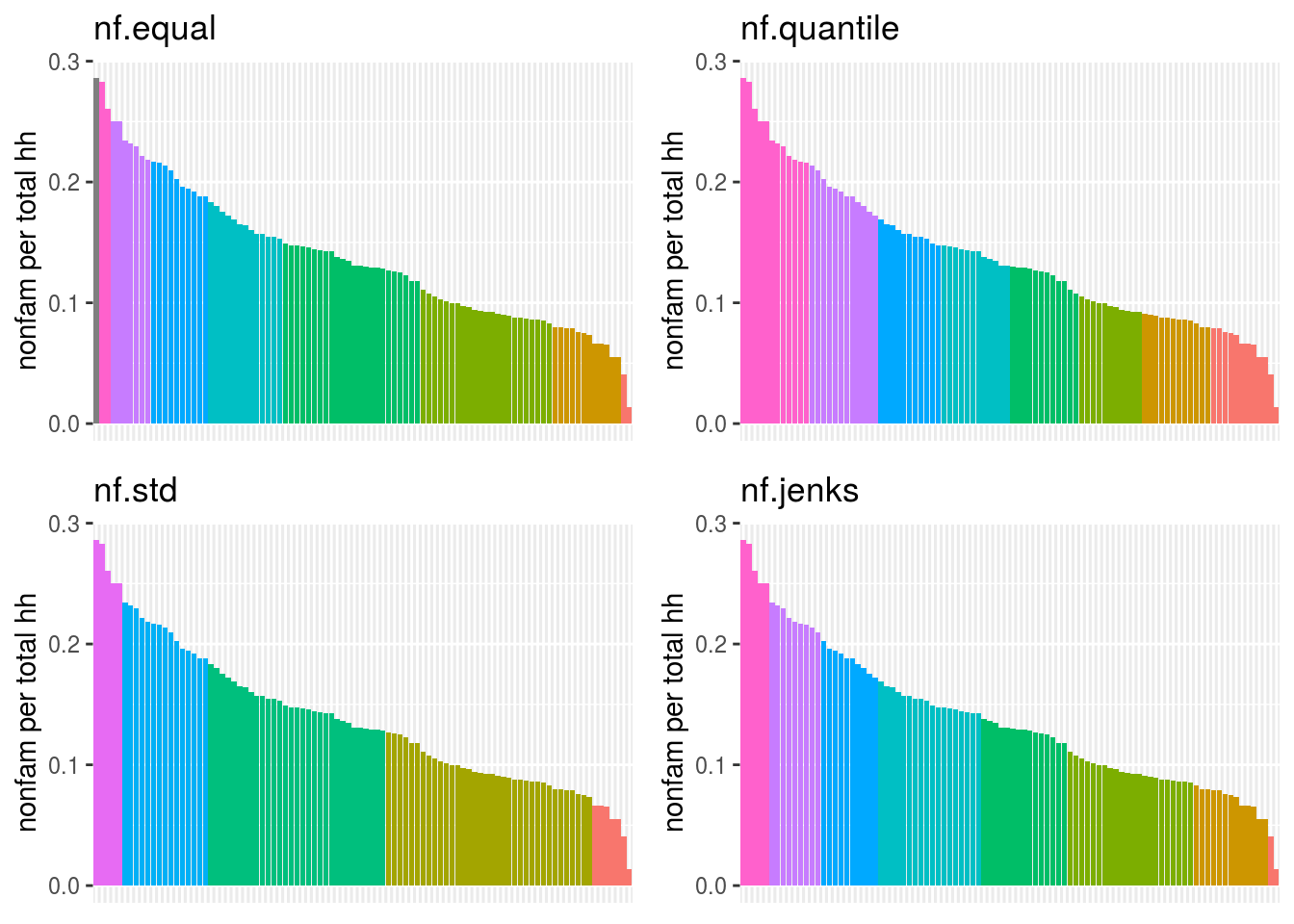
Challenge 8:
Perform a similar analysis for the census data column you are working with. Is six the right number of bins? Which method works best for your specific data?
bounds_hh %>%
  mutate(NAME = fct_reorder(NAME, desc(nonfam_hh))) %>%
  ggplot(aes(x = NAME, y = nonfam_hh)) +
  geom_bar(stat = "identity", na.rm = TRUE) +
  theme_minimal()
## Warning: Removed 4 rows containing missing values (position_stack).
bounds_hh %>%
  ggplot(aes(x = nonfam_hh)) +
  geom_histogram() +
  theme_minimal()
## `stat_bin()` using `bins = 30`. Pick better value with `binwidth`.## Warning: Removed 4 rows containing non-finite values (stat_bin).
# following https://blog.datawrapper.de/how-to-choose-a-color-palette-for-choropleth-maps/
# and https://rpubs.com/danielkirsch/styling-choropleth-maps

min.nf <- min(bounds_hh$nonfam_hh, na.rm=TRUE)
max.nf <- max(bounds_hh$nonfam_hh, na.rm=TRUE)
diff.nf <- max.nf - min.nf
std.dev.nf <- sd(bounds_hh$nonfam_hh, na.rm = TRUE)

# some possible color break points - NOTE: 8 LOOKS MORE EVEN THAN 6
equal.interval <- seq(min.nf, max.nf, by = diff.nf / 8)
quantile.interval <- quantile(bounds_hh$nonfam_hh, probs=seq(0, 1, by = 1/8), na.rm = TRUE)
std.interval <- c(seq(min.nf, max.nf, by=std.dev.nf), max.nf)
jenks.interval <- classIntervals(bounds_hh$nonfam_hh, n=8, style='jenks')$brks
## Warning in classIntervals(bounds_hh$nonfam_hh, n = 8, style = "jenks"): var has
## missing values, omitted in finding classesbounds_hh$nf.equal = cut(bounds_hh$nonfam_h, breaks = equal.interval, include.lowest = TRUE)
bounds_hh$nf.quantile = cut(bounds_hh$nonfam_h, breaks = quantile.interval, include.lowest = TRUE)
bounds_hh$nf.std = cut(bounds_hh$nonfam_h, breaks = std.interval, include.lowest = TRUE)
bounds_hh$nf.jenks = cut(bounds_hh$nonfam_h, breaks = jenks.interval, include.lowest = TRUE)nfBarChart <- function(break_col) {
bounds_hh %>%
filter(!is.na(nonfam_hh)) %>%
ggplot(mapping = aes(x=fct_reorder(NAME, -nonfam_hh), y=nonfam_hh)) +
geom_col(aes(fill=.data[[break_col]])) +
theme(axis.text.x=element_blank(), axis.ticks.x=element_blank()) +
scale_y_continuous(name = "nonfam per total hh") +
scale_x_discrete(name=NULL) +
scale_fill_discrete(guide=FALSE) +
ggtitle(break_col)
}
plot_grid(
nfBarChart("nf.equal"),
nfBarChart("nf.quantile"),
nfBarChart("nf.std"),
nfBarChart("nf.jenks"),
nrow=2, ncol=2
)
nfMaps <- function(map_breaks) {
bounds_hh %>%
  ggplot() +
#  geom_sf(aes(fill = nf.jenks)) +
  geom_sf(aes(fill = .data[[map_breaks]])) +
  scale_fill_brewer(palette = "OrRd", direction = 1, na.value = "grey35") +
  labs(title = "Proportion of non-family households",
#       subtitle = "Nonfamily households per total households",
       fill = map_breaks) +
  geom_sf(data = river_bounds, fill="#026F86", size=0.0) +
  theme_minimal() +
  theme(axis.text = element_text(size = 6),
        title = element_text(size = 6),
        legend.title = element_text(size = 8),
        legend.text = element_text(size = 4),
        legend.key.size = unit(6, "points"),
        legend.box.margin = margin(6, 6, 6, 6, "points")
        )
}

plot_grid(
  nfMaps("nf.equal"),
  nfMaps("nf.quantile"),
  nfMaps("nf.std"),
  nfMaps("nf.jenks"),
  nrow = 2, ncol = 2
)
I think that
 nf.jenks has given the most nuanced distinction in the breaks:
bounds_hh %>%
  ggplot() +
  geom_sf(aes(fill = nf.jenks), colour = "grey20") +
  scale_fill_brewer(palette = "OrRd", direction = 1, na.value = "grey35") +
  labs(title = "Proportion of non-family households",
       subtitle = "Nonfamily households per total households",
       fill = "nf.jenks") +
  geom_sf(data = river_bounds, fill="#026F86", size=0.0) +
  theme_minimal()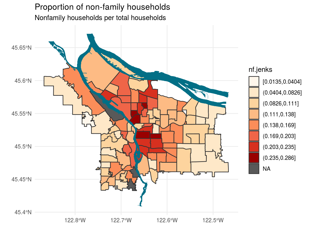
As someone who has taken long walks to get out of my Richmond apartment during COVID times, I would definitely agree that Laurelhurst seems like a neighborhood with only families living in houses. This is much more apparent here than in the continuous fill graph from challenge 7, which had really distinction at the lower ends.