Introduction:
This assignment was the pinnacle of our focus on plotting in R. We used the concepts from the entire calss thus far (human perception, color theory, graph design) to dive into one specific type of plot. I chose to explore the Dumbbell Plot using data about NCAA coach salaries and university spending on athletic departments.
Dumbbell Plots
Other names include: Cleveland dotplot, connected dotplot, horizontal lollipop plot
Example graph:
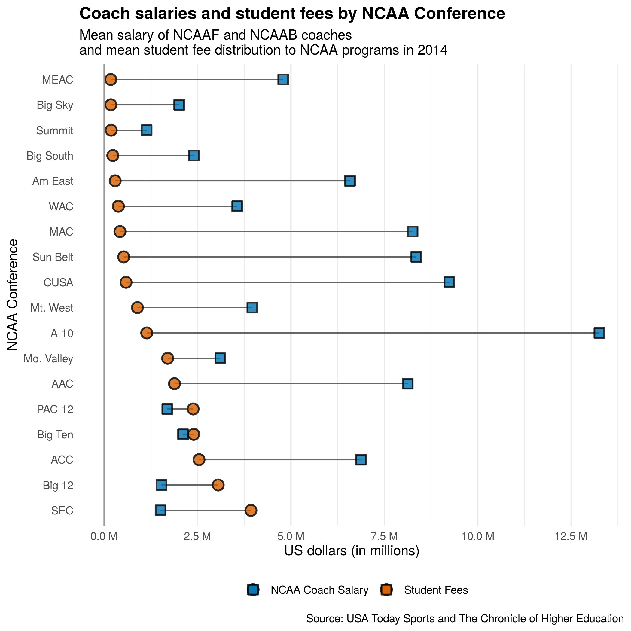
Comparing the average 2014 salary of NCAA Football and Basketball Head Coaches with the average student fee contribution to NCAA Departments in 2014.
Data:
The Chronicle of Higher Education keeps a dataset of funding sources for collegiate athletic departments here, from which I pulled the student fee contribution data. USA Today Sports reports annually on the salaries of NCAAF and NCAAB coaches. While these pages are updated each year, I used the Internet Archive’s WaybackMachine to view 2014 data for NCAAF and NCAAB salaries.
I used the university’s name and NCAA conference to compare data between the three sources. While I wish the data were more complete (there were many universities missing from one source), I calculated the average head coach salaries and the mean student fees allocated to athletics within each conference. Since these data have the same units and were calculated in the same manner, I can use the same axis to represent both sets of qualitative data.
Description:
The dual dotplot nature of dumbbell plots allow easy comparison between two sets of continuous quantitative data from one (shared) discrete variable. Data are typically presented as two points per discrete variable, often connected by a line segment. A horizontal dumbbell plot puts the quantitative variable on the X axis and the categorical data on the Y axis (somewhat reminiscent of ridgeline density plots), which allows for longer labels. The data should be ordered by the values of one numerical variable to facilitate comparison.
How to read it and what to look for:
Dumbbell plots are fairly straightforward to read. If the data is properly ordered, comparisons can be drawn within each subcategory based on the position of the points and between the categories based on the linear distance between the sets of points.
One major drawback of dumbbell plots is their lack of error bars or other visual depictions of deviation. Close attention should be paid to figure descriptions to determine the value represented by each point and additional information or figures should be used to depict the error of each value. In addition, dummbbell plots should not be used to compare quantitative data with separate scales, since this can be easily exploited to portray relationships that may not have any relevance. The reader should always verify the scale used with this plot. If log-based scales are used, it can be much more difficult to correlate physical distance between points and difference in scale.
Presentation tips:
Annotation:
Annotation should be used sparingly since the graphs are already visually busy. One powerful annotation tool is a vertical line that demarks some relevant value, since this also can help readers compare linear distances between points. Faint vertical gridlines are an additional help in this regard. As with all plots, legends and axes should be clearly marked.
Color:
Since, as in the example plot, the two data sets can ‘cross over’ each other, it’s important to use color and shape to distinguish both data sets. A clear legend should also be included. In rare situtations, annotating key points with highly saturated colors can help guide viewers to important conclusions. However, reducing the number of colors helps to simplify the plot.
Composition:
Dumbbell plots must be ordered by the values of one of the numerical variables in order for any comparison to be drawn. While some outliers may still be recognized in unordered data, dumbbell plots lose their ability to portray relationships between two data sets. They rely on the Gestalt principles of proximity (distance between points of the same categorical variable) and continuation (implied curves that connect the data points within each numerical set) for meaning. That said, the ordering of the data should also be declared in the figure description.
If line segments are not used to connect the two data sets, faint horizontal gridlines should be included to help the reader align data points, especially if there is a large amount of data presented.
Variations and alternatives:
Dumbbell plots can be presented either horizontally (as in the example plot) or vertically. Data can also be grouped into multiple faceted plots. Error bars can also be added to each point (but may run the risk of overcomplicating the plot). While additional data sets can be added to the plot, they typically disrupt the linear comparisons and would be suited for a different plot.
Alternative methods to display two subcategories of data are stacked bar charts and, occasionally, pie charts. While stacked bar charts can allow comparison between more than two subcategories, dumbbell plots are advantageous in that they utilize lengths to represent data (instead of area).
While dummbell plots are particularly powerful for presenting large sets of data at a 30,000 foot view, their lack of error bars hinders comparison between smaller data sets. Boxplots and beeswarms are much better in this regard, but lose meaning in large data sets. Another alternative are ridgeline plots.
How to create it:
The most difficult part of making a dumbbell plot is in ordering the data.
Data wrangling:
library(tidyverse)
## ── Attaching packages ───────────────────────────────────────────────────────────────────────── tidyverse 1.3.0 ──
## ✓ ggplot2 3.3.1     ✓ purrr   0.3.4
## ✓ tibble  3.0.1     ✓ dplyr   1.0.0
## ✓ tidyr   1.1.0     ✓ stringr 1.4.0
## ✓ readr   1.3.1     ✓ forcats 0.5.0
## ── Conflicts ──────────────────────────────────────────────────────────────────────────── tidyverse_conflicts() ──
## x dplyr::filter() masks stats::filter()
## x dplyr::lag()    masks stats::lag()
library(janitor)
##
## Attaching package: 'janitor'
## The following objects are masked from 'package:stats':
##
##     chisq.test, fisher.test
library(readxl)
library(here)
First, create and tidy the data from each of the three sources:
# Football Head Coach salaries: (note: data has been edited to rename universities and conferences prior to uploading)
ncaa_football <- read_xlsx(here("/static/projects/USAToday_2014_NCAAF_coach_salary.xlsx")) %>%
  clean_names() %>%
  mutate_at(vars(school_pay:max_bonus),~as.numeric(.)) %>%
  select(school, conf, school_pay) %>%
  rename(conference = conf) %>%
  arrange(school)

# Basketball Head Coach salaries: (note: data has been edited to rename universities and conferences prior to uploading)
ncaa_bball <- read_xlsx(here("/static/projects/USAToday_2014_NCAAB_coach_salary.xlsx")) %>%
  clean_names() %>%
  mutate_at(vars(school_pay:max_bonus), ~as.numeric(.)) %>%
  select(school, conf, school_pay) %>%
  rename(conference = conf, sch = school)

# NCAA money data: (note: data has been edited to rename universities and conferences prior to uploading)
ncaa_funding <- read_csv(here("/static/projects/ncaa_realscore_edited.csv")) %>%
  clean_names() %>%
  rename(school = chronname) %>%
  select(school, conference, student_fees)
## Parsed with column specification:
## cols(
## .default = col_double(),
## instnm = col_character(),
## chronname = col_character(),
## conference = col_character(),
## city = col_character(),
## state = col_character()
## )## See spec(...) for full column specifications.ncaa_football %>% colnames()## [1] "school" "conference" "school_pay"ncaa_bball %>% colnames()## [1] "sch" "conference" "school_pay"ncaa_funding %>% colnames()## [1] "school" "conference" "student_fees"# Now combine the data together!
ncaa_data <- left_join(ncaa_funding, ncaa_football,
by = c("school" = "school", "conference" = "conference"), keep = FALSE) %>%
left_join(ncaa_bball, by = c("school" = "sch", "conference" = "conference"), keep = TRUE,
suffix = c("_football", "_bball")) %>%
group_by(school) %>%
mutate(avg_coach_pay = case_when(
school_pay_football > 0 & school_pay_bball > 0 ~ (school_pay_football + school_pay_bball)/2,
school_pay_bball > 0 ~ school_pay_bball,
school_pay_football > 0 ~ school_pay_football)) %>%
ungroup() %>%
filter(!is.na(school) & !is.na(avg_coach_pay)) %>%
select(-conference_bball) %>%
rename(conference = conference_football) %>%
group_by(conference) %>%
summarise_if(is.numeric, mean, na.rm = TRUE, keep = TRUE) %>% # here I average all the data by conference
mutate(conference = fct_reorder(conference, desc(avg_coach_pay))) %>% # use the *forcats* package to order your data!
filter(student_fees > 0)
ncaa_data## # A tibble: 18 x 5
## conference student_fees school_pay_football school_pay_bball avg_coach_pay
## <fct> <dbl> <dbl> <dbl> <dbl>
## 1 A-10 13254554 NaN 1140679 1140679
## 2 AAC 8124306. 1355296. 2532633 1883260.
## 3 ACC 6870986. 2525570. 2042182. 2539723.
## 4 Am East 6578669 NaN 295000 295000
## 5 Big 12 1534937 3410556. 2710153. 3051591.
## 6 Big Sky 2009728 NaN 180000 180000
## 7 Big South 2401677 NaN 232348 232348
## 8 Big Ten 2114079. 2729621. 2386826. 2396947.
## 9 CUSA 9240228. 586131. NaN 586131.
## 10 MAC 8255696. 427059. 310000 423622.
## 11 MEAC 4794357 NaN 178067 178067
## 12 Mo. Valley 3110501 NaN 1700000 1700000
## 13 Mt. West 3966704. 892188. 750000 890928.
## 14 PAC-12 1690684. 2479873. 2179095. 2381796.
## 15 SEC 1509470. 3777059. 4537982 3929203.
## 16 Summit 1136761 NaN 188347 188347
## 17 Sun Belt 8354628. 523598. NaN 523598.
## 18 WAC 3562370 NaN 381274 381274Now, create a dumbbell plot using geom_point and geom_segment. For horizontal plots, it’s easiest to simply flip the coordinates.
color_var <- c("#0072B2", "#D55E00")

ncaa_graph <- ggplot(data = ncaa_data) +
  # put your line segments first so the points will layer over them
    geom_segment(aes(x = conference, xend = conference, y = student_fees, yend = avg_coach_pay), colour = "grey40", na.rm = TRUE) +
  # use 2 different shapes for your points to improve clarity, especially in grayscale
    geom_point(aes(x = conference, y = avg_coach_pay, fill = "#D55E00"), size = 3.5, shape = 21,
               na.rm = TRUE, stroke = 1, alpha = 0.8, show.legend = TRUE) +
    geom_point(aes(x = conference, y = student_fees, fill = "#0072B2"), size = 3.5, shape = 22,
               na.rm = TRUE, stroke = 1, alpha = 0.8, show.legend = TRUE) +
  coord_flip() + # this makes the graph horizontal!
  scale_y_continuous(labels = scales::unit_format(unit = "M", scale = 1e-6), breaks = seq(0, 12500000, 2500000)) +
  geom_hline(yintercept = 0, colour = "grey60") +
  scale_fill_manual(values = color_var, labels = c("NCAA Coach Salary", "Student Fees")) +
  theme_minimal() +
  labs(title = "Coach salaries and student fees by NCAA Conference",
       subtitle = "Mean salary of NCAAF and NCAAB coaches \nand mean student fee distribution to NCAA programs in 2014",
       y = "US dollars (in millions)",
       x = 'NCAA Conference',
       caption = "Source: USA Today Sports and The Chronicle of Higher Education",
       fill = "Legend") +
  theme(panel.grid.major.y = element_blank(),
        plot.title = element_text(face = "bold"),
        legend.title = element_blank(),
        legend.position = "bottom")

ncaa_graph
To create faceted/grouped plots, additional packages like tidytext are helpful.
library(tidytext)ncaa_data_ungroup <- left_join(ncaa_funding, ncaa_football,
by = c("school" = "school", "conference" = "conference"), keep = FALSE) %>%
left_join(ncaa_bball, by = c("school" = "sch", "conference" = "conference"), keep = TRUE,
suffix = c("_football", "_bball")) %>%
select(-conference_bball, -sch) %>%
rename(conference = conference_football) %>%
group_by(school) %>%
mutate(avg_coach_pay = case_when(
school_pay_football > 0 & school_pay_bball > 0 ~ (school_pay_football + school_pay_bball)/2,
school_pay_bball > 0 ~ school_pay_bball,
school_pay_football > 0 ~ school_pay_football)) %>%
arrange(conference) %>%
ungroup() %>%
filter(!is.na(school) & !is.na(avg_coach_pay) & student_fees > 0) %>%
# here use tidytext::reorder_within to reorder the school data by avg_coach_pay, grouped by conference. I'm using sum because it doesn't return an error when calculating with only one value
mutate(school_ord = reorder_within(x = school, by = avg_coach_pay, within = conference, fun = sum)) %>%
filter(conference %in% c('SEC', 'PAC-12', 'Big Ten', 'ACC')) %>% # just to pare down the data a bit...
group_by(conference)
ggplot(data = ncaa_data_ungroup)+
geom_segment(aes(x = school_ord, xend = school_ord, y = avg_coach_pay, yend = student_fees), colour = "grey40", na.rm = TRUE) +
facet_wrap(~conference, ncol = 1, drop = FALSE, scales = "free_y") +
geom_point(aes(x = school_ord, y = avg_coach_pay, fill = "#D55E00"), size = 3, shape = 21, alpha = 0.6, na.rm = TRUE) +
geom_point(aes(x = school_ord, y = student_fees, fill = "#0072B2"), size = 3, shape = 21, alpha = 0.6, na.rm = TRUE) +
coord_flip() +
scale_x_reordered() + # this is the key to tidytext::reorder_within! It translates your ordered variable back to normal
scale_y_continuous(labels = scales::unit_format(unit = "M", scale = 1e-6)) +
geom_hline(yintercept = 0) +
scale_fill_manual(values = color_var, labels = c("NCAA Coach Salary", "Student Fees")) +
theme_minimal() +
labs(title = "Coach salaries and student fees by NCAA Conference",
subtitle = "Mean salary of NCAAF and NCAAB coaches \nand student fee distribution to NCAA programs in 2014",
y = "US dollars (in millions)", x = 'NCAA Conference',
caption = "Source: USA Today Sports and The Chronicle of Higher Education", fill = "Legend") +
theme(panel.grid.major.y = element_blank(),
plot.title = element_text(face = "bold"),
legend.title = element_blank(),
legend.position = "right")