Raincloud plots
Data
For this final project, I used data from my own research. This assignment coincided with the return of reviewer comments on our submitted manuscript, which included feedback on a difficult-to-understand plot. This specific graph generated significant stress in our lab group, because we wanted to acknowledge the range of the data while also showing the important differences between the conditions within the smaller values.
Our lab had created an airway epithelial cell line that stably expresses our protein of interest fused to GFP. We took confocal microscopy images of these cells after various treatments to see how the localization of this protain might change. We then used Imaris to algorithmically identify the endosomal-like compartments within which our protein resides and quantified the volumes of these compartments.
Ultimately, the data used in this visualization include the quantitative volume variable and the categorical treatment condition variable.
Audience
This paper is submitted to Scientific Reports - a journal that publishes papers across scientific fields, from Earth Sciences to Health Sciences. As such, the intended audience is a more broad scientific audience, which meant that I needed to display the data in a manner approachable to people unfamiliar with the specific field.
Graph type and approach
Raincloud plots combine scatterplots, violin plots, and box-and-whisker plots to thoroughly illustrate the data. Their strength is to display descriptive statistics about the data (through the boxplots), the distribution of the data (through the split violin plots), and each individual data point (which is especially important in showing outliers). One key consideration for raincloud plots is their potential to become cluttered and overwhelm the viewer. Careful design of these graphs is necessary to maintain a reasonable data-ink ratio.
Raincloud plots are designed to specifically display the data in a straightforward mannner that accurately shows layers of distributions. While raincloud plots require that the audience understand the basics of data distribution and statistics, I assume that the majority of Scientific Reports readers will have this knowledge.
Approaching the plot depends on the features of the data shown. Comparing the means and error shown in the boxplot (in addition to statistical analysis, if applicable) helps to give a broad idea of the differences between the conditions. The split violin plots are useful to examine non-normal distributions. For example, biologically relevant bimodal populations can clearly be illustrated. Lastly, outliers are easily detectable in the individual data points and can help the reader dive further into the data, if desired.
Representation:
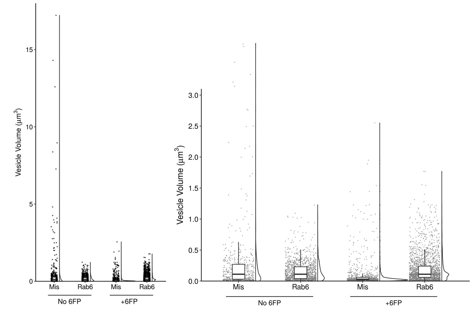
Figure 4c
In order to best represent the range of the data and the significant differences at low volumes, I ultimately split the figure into two panels. On the left, I show the entire range of volumes - here, the individual data points are key to see the outliers in the condition of “Mis and No 6FP”.
On the right, I added a panel that “zooms in” on the data to show the low volume populations. This clearly illustrates the smaller population in the “Mis and +6FP”.
Presentation:
The final version of my plot must be in grayscale to fit the journal’s requirements and the other plots in the figure. That said, I modified the transparancy of each data point to give a slight indication where multiple points are overlaid, and used a uniform grey color to allow visualization of the black boxplot whiskers on top. I played with the transparancy of the boxes but ultimately decided that minimizing clutter in the plot outweighed showing the hidden data points.
Instead of using color to encode the treatment condition, I used position and annotation to clearly label the four sets of data. Throughout the other figures in this paper, the data is arranged in the same order of Mis then Rab6, No 6FP then 6FP. The annotation style for these labels is also consistent with the rest of the paper. This consistency is important to reduce the mental strain of analysing the data.
I specifically chose to keep the violin plots and boxplots in the left panel. Although they do not add to analysing the data in that plot, the change in area of the violin and height of the box between the two panels helps to show how changing the scale changes the distribution of the data. For the size of the violin plots, I chose to use the default setting of keeping the area of each plot consistent. An earlier figure explores the different number of compartments per cell by condition, so encoding the width of the violin plot based on the total number of data points is confused by this biologically relevant difference in total number. As such, I chose to display the relative distribution of data points by keeping area consistent. Additionally, the scatterplots show the total number of data points in each condition to make up for this.
Lastly, the font I used has two purposes. First, it is consistent across the other paper figures. Second, given that the paper has labels of both “6FP” (6-formylpterin, a small molecule from the degradation of folic acid) and “GFP” (green fluorescent protein), I wanted to use a font that distinguishes between G and 6.
Methods:
Start with the data wrangling!
Because I collected my own data, it is fairly tidy already, but I’ll still need to do some modifications to make it happy in R.
library(tidyverse)
## ── Attaching packages ───────────────────────────────────────────────────────────────────────── tidyverse 1.3.0 ──
## ✓ ggplot2 3.3.2     ✓ purrr   0.3.4
## ✓ tibble  3.0.1     ✓ dplyr   1.0.0
## ✓ tidyr   1.1.0     ✓ stringr 1.4.0
## ✓ readr   1.3.1     ✓ forcats 0.5.0
## ── Conflicts ──────────────────────────────────────────────────────────────────────────── tidyverse_conflicts() ──
## x dplyr::filter() masks stats::filter()
## x dplyr::lag()    masks stats::lag()
library(readxl)
library(janitor)
##
## Attaching package: 'janitor'
## The following objects are masked from 'package:stats':
##
##     chisq.test, fisher.test
library(here)
## here() starts at /cloud/project
library(ggbeeswarm)
library(cowplot)
##
## ********************************************************
## Note: As of version 1.0.0, cowplot does not change the
##   default ggplot2 theme anymore. To recover the previous
##   behavior, execute:
##   theme_set(theme_cowplot())
## ********************************************************

fig_4c_data <- read_excel(here::here("/static/projects/type_one_and_twoB.xlsx")) %>%
  clean_names() %>%
  pivot_longer(everything(), names_to = "kd_timing", values_to = "ves_vol") %>%
  arrange(kd_timing) %>%
  filter(!is.na(ves_vol)) %>%
# now remove data that is not used in this plot
  filter(kd_timing %in% c("mis_preexist", "rab6_preexist", "mis_6fp_preexist", "rab6_6fp_preexist")) %>%
# order the data appropriately for the graph using the forcats package
  mutate(kd_timing = as.factor(kd_timing),
         kd_timing = fct_relevel(kd_timing, "mis_preexist", "rab6_preexist", "mis_6fp_preexist", "rab6_6fp_preexist"))
Prepare to graph
Now that the data is tidied, let’s create the function geom_flat_violin based on Allen et al. 2019
# somewhat hackish solution to:
# https://twitter.com/EamonCaddigan/status/646759751242620928
# based mostly on copy/pasting from ggplot2 geom_violin source:
# https://github.com/hadley/ggplot2/blob/master/R/geom-violin.r

library(ggplot2)
library(dplyr)

"%||%" <- function(a, b) {
  if (!is.null(a)) a else b
}

geom_flat_violin <- function(mapping = NULL, data = NULL, stat = "ydensity",
                             position = "dodge", trim = TRUE, scale = "area",
                             show.legend = NA, inherit.aes = TRUE, ...) {
  layer(
    data = data,
    mapping = mapping,
    stat = stat,
    geom = GeomFlatViolin,
    position = position,
    show.legend = show.legend,
    inherit.aes = inherit.aes,
    params = list(
      trim = trim,
      scale = scale,
      ...
    )
  )
}

#' @rdname ggplot2-ggproto
#' @format NULL
#' @usage NULL
#' @export
GeomFlatViolin <-
  ggproto("GeomFlatViolin", Geom,
          setup_data = function(data, params) {
            data$width <- data$width %||%
              params$width %||% (resolution(data$x, FALSE) * 0.9)

            # ymin, ymax, xmin, and xmax define the bounding rectangle for each group
            data %>%
              group_by(group) %>%
              mutate(ymin = min(y),
                     ymax = max(y),
                     xmin = x,
                     xmax = x + width / 2)
  #)
          },

  draw_group = function(data, panel_scales, coord) {
    # Find the points for the line to go all the way around
    data <- transform(data, xminv = x,
                      xmaxv = x + violinwidth * (xmax - x))

    # Make sure it's sorted properly to draw the outline
    newdata <- rbind(plyr::arrange(transform(data, x = xminv), y),
                     plyr::arrange(transform(data, x = xmaxv), -y))

    # Close the polygon: set first and last point the same
    # Needed for coord_polar and such
    newdata <- rbind(newdata, newdata[1,])

    ggplot2:::ggname("geom_flat_violin", GeomPolygon$draw_panel(newdata, panel_scales, coord))
  },

  draw_key = draw_key_polygon,

  default_aes = aes(weight = 1, colour = "grey20", fill = "white", size = 0.5,
                    alpha = NA, linetype = "solid"),

  required_aes = c("x", "y")
  )
With that sorted, we can now graph the data!
The original plot was created using GraphPad, but here is a decent re-creation of it in R.
fig_4c_data %>% ggplot() +
  geom_quasirandom(aes(x = kd_timing, y = ves_vol), size = 0.5, width = 0.15, bandwidth = 0.5) +
  scale_y_continuous(expand = c(0,0)) +
  theme_classic()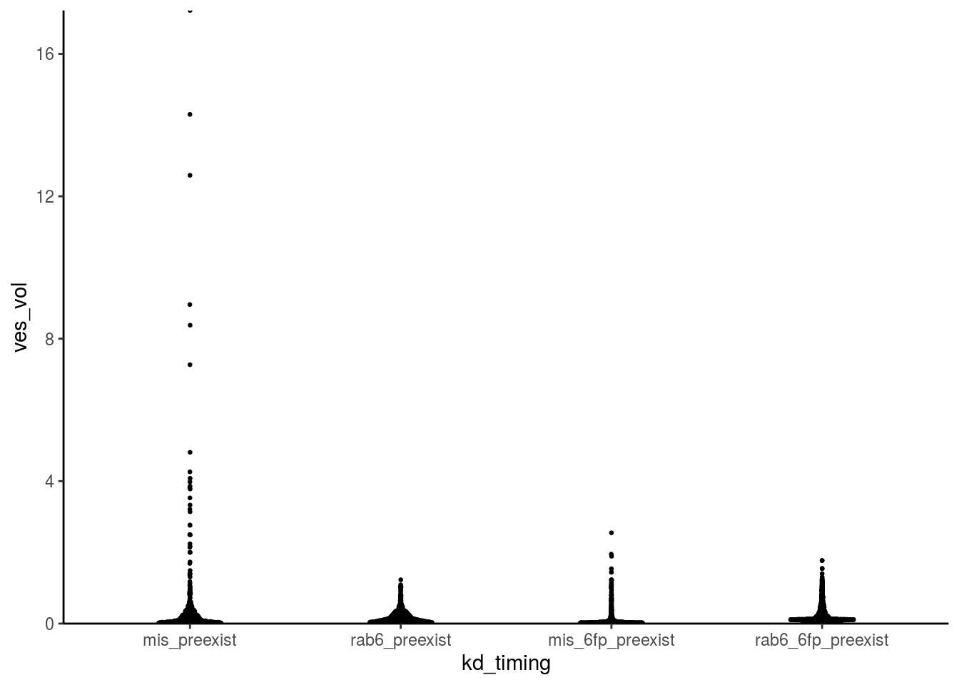
Let’s fix this with side-by-side raincloud plots!
fig_4c_left <- ggplot(data = fig_4c_data, aes(x = kd_timing, y = ves_vol)) +
  geom_flat_violin(scale = "area", position = position_nudge(y = 0, x = 0.17), alpha = 0.8) +
  geom_point(position = position_jitter(width = 0.1), size = 0.3, alpha = 0.6) +
  geom_boxplot(width = 0.1, outlier.shape = NA, alpha = 0.85) +
  theme_classic() +
  scale_y_continuous(breaks = seq(0,15,5), expand = c(0,0)) +
  scale_x_discrete(labels = c("Mis", "Rab6", "Mis", "Rab6")) +
  labs(x = "",
       y = expression(paste("Vesicle Volume (", mu, m^{3}, ")"))) +
  coord_fixed(ratio = 0.5, ylim = c(0,18), clip = "off") +
  annotate("text", x = 1.5, y = -1.4, label = "No 6FP", size = 4) +
  annotate("text", x = 3.5, y = -1.4, label = "+6FP", size = 4) +
  geom_segment(aes(x = 0.8, xend = 2.2, y = -0.9, yend = -0.9), size = 0.4) +
  geom_segment(aes(x = 2.8, xend = 4.2, y = -0.9, yend = -0.9), size = 0.4) +
  theme(axis.text = element_text(size = 11, colour = "black"),
        axis.title.y = element_text(size = 12, colour = "black"))

fig_4c_right <- ggplot(data = fig_4c_data, aes(x = kd_timing, y = ves_vol)) +
  geom_flat_violin(scale = "area", position = position_nudge(y = 0, x = 0.275), alpha = 0.8) +
  geom_point(position = position_jitter(width = 0.25), size = 0.1, alpha = 0.6, colour = "grey50") +
  geom_boxplot(width = 0.2, outlier.shape = NA, alpha = 1) +
  theme_classic() +
  scale_y_continuous(breaks = seq(0,3,0.5), expand = c(0,0)) +
  scale_x_discrete(labels = c("Mis", "Rab6", "Mis", "Rab6")) +
  labs(x = "",
       y = expression(paste("Vesicle Volume (", mu, m^{3}, ")"))) +
  coord_fixed(ratio = 1.0, ylim = c(0,3.1), clip = "off") +
  annotate("text", x = 1.5, y = -0.35, label = "No 6FP", size = 4) +
  annotate("text", x = 3.5, y = -0.35, label = "+6FP", size = 4) +
  geom_segment(aes(x = 0.8, xend = 2.2, y = -0.25, yend = -0.25), size = 0.45) +
  geom_segment(aes(x = 2.8, xend = 4.2, y = -0.25, yend = -0.25), size = 0.45) +
  theme(axis.text = element_text(size = 12, colour = "black"),
        axis.title.y = element_text(size = 14, colour = "black"))

plot_grid(fig_4c_left,fig_4c_right, labels = c("C",""), axis = "b", greedy = FALSE, rel_widths = c(1,2))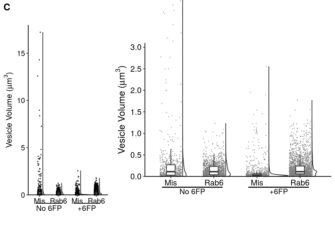
NOTE: cowplot::plot_grid has issues with the labels I used to annotate the +/- 6FP conditions, so the two graphs are not aligned in this Rmarkdown file (but will be manually aligned in designing the actual figure).